

ROLE
Market Researcher
UX Designer
TOOLS
Adobe Illustrator
Figma
Coolors.co
TIMELINE
4 months
(Jan - April 2023)
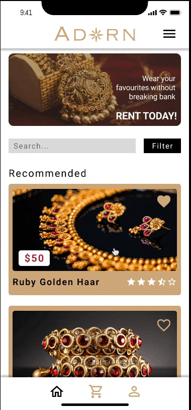
Adorn is a mobile application that lets users buy or rent traditional jewelry that is affordable.
Valued at $340.69 billion USD in 2022, the global jewelry market is expected to expand at an annual growth rate of 4.6% from 2023 to 2030
My research will focus on analyzing the different user experience from different jewelry companies. Learning about their value propositions to understand how they stand out. Targeted towards the South Asian community, this app aims to provide a plethora of selection for customers who crave to wear beautiful authentic jewelry to their traditional functions.
Identifying the Problem
Although there are several stores that provide traditional South Asian jewelry in Canada, not many people are aware of its existence. At the same time, people often wear traditional authentic jewelry during cultural or religious events which occur once a year. After that, the jewelry gets locked away inside the far corner of the drawer never to be seen again. On top of that, the fashion industry is constantly changing and coming up with new trends. People want to splurge on newer and prettier designs that have been released into the market.
User Personas


Based on these user personas my overall design question was as follow:
How might we...
connect South Asian individuals to find jewelry that is traditional yet affordable?
Alicia's User Flow

Competitive Strategy
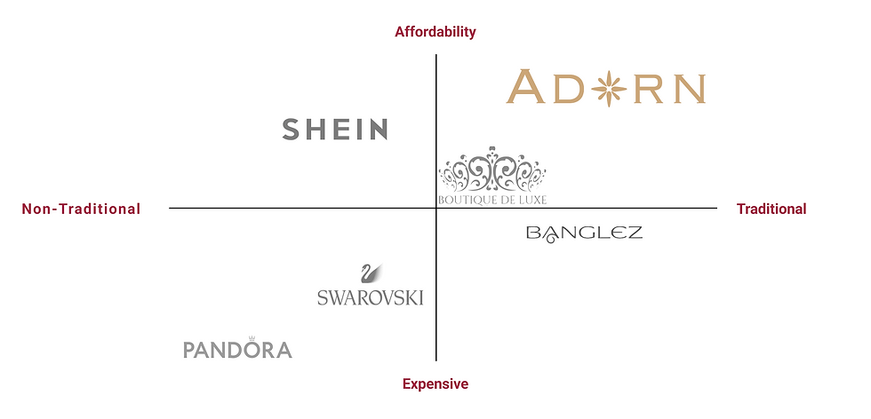
Adorn's main competitors would be Boutique De Luxe and Shein, as one gives more traditional jewelry selection to customers, while the other provides affordable products all through North America. While Banglez also makes it to the top three competitors for Adorn, their products are more expensive as they are custom made. Adorn provide the options to either buy or rent jewelry which makes it more affordable for the target audience.
Adorn SiteMap

Design Elements

Choosing colors that would match the theme of the app which is jewelry. The logo was also designed to embody the idea of providing jewelry collections that people can wear thus adorn themselves with. As per research, it was seen that many jewelry applications or sites used cursive fonts to represent their jewelry. However, affluential stores like Swarovski and Pandora keep it simple by using sans font types which made their website UIs easy to navigate. Hence, to keep the UI from being too cluttered, Roboto was selected to be the primary font used across the design of the app.
Aa
Bold
Aa
Medium
Aa
Normal
Roboto Font Family
ABCDEFGHIJLKMNOPQRSTUVWXYZ
abdcdefghijklmnopqrstuwxyz
0123456789
Concepting the Experience
CONCEPT #1:
Center of Attention
Showing recommended jewelry options based on past orders and popularity. Since this is a mobile, each piece and collection is displayed, one by one in a row so that users can view them properly.
UX VALUES:
-
Minimalistic
-
Focus on one item at a time
-
In-demand items displayed for the user
PROS:
-
The dark background gives more attention to the jewelry items.
-
User can favourite any item to later view it at their convenience.
-
Would increase business due to placed ads and marketing.
CONS:
-
First time customers might not have an idea where to start.
-
Items are not categorized.
CONCEPT #2:
Everything Everywhere All at Once
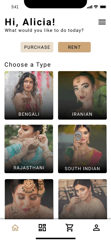
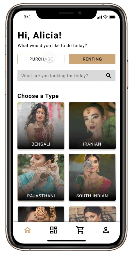
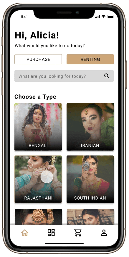
Showing all the types of jewelry available by region at the very beginning to get the user started. From product specifications to product reviews so customers can buy with reassurance. Two types of filter is presented so customers can choose the type of jewelry they want and also filter out options like budgeting.
UX VALUES:
-
Picturesque
-
Informative regarding each item
-
Visually concentrated
CONS:
-
Might be overwhelming for the customer as all the options are posted.
-
UI can get very busy with information.
PROS:
-
A similar UI to Uber, so users won't have problems navigating.
-
User's can visualize what they are looking for based on the pictures.
-
Ability to filter out the types of jewelry they would like to buy at the moment.
CONCEPT #3:
The Ackinator
Users are asked a series of questions to give them a more personalized experience based on their needs and wants. Someone that has no knowledge on jewelry would have no problem using this as the app asks all the right questions to get them started.
UX VALUES:
-
Interactive Questions
-
Concise
-
Works like a step-by-step tutorial
CONS:
-
Makes the user go through multiple pages in order for them to shop.
-
This will be a frustrating experience as the app asks a lot of questions.
PROS:
-
Liberty to filter out the options from the start.
-
Page indicator at the top right to let the users know how many questions they need to answer.
-
A "previous" button added, in case user would like to change their selection.

CHOSEN CONCEPT:
Everything Everywhere All at Once
After analyzing the pros and cons of all the concepts, I am going to move forward with the above concept. Like its name, the UI has everything that would help customers in their journey to purchase or rent an item. Customers are given a visual representation of the type of look they can aim for at the start of their journey.
Unlike the Ackinator, users are not forced to filter out options at the start of their journey. With the two types of filter that are present, customers have the liberty to filter out jewelry or simply browse their options. At the same time, if the user wants to filter out more options based on their budget or item popularity, they can do so by simply clicking on the filter button.
Once the users find the item they want to know more about, they get a preview of the item in different angles. Instead of presenting those views in a slider (like in the Center of Attention concept), users are given a small sneak pee to get them more interested in the jewelry.

User Testing
After wireframing some screens for the mobile app, I conducted a user test to see if the UI created was usable or not. A Protocol with test questions was created that would investigate how potential users would interact with my application. Below are some very important suggestions and requirements that my test users indicated in the initial part of the prototype design.
ACTIONABLE ITEMS:
To understand the usability of the wireframes I have created, I tested my initial prototype on test users who navigated my application through Figma. Upon testing, I noticed the parts where they were having trouble navigating through the application. Things like button color contrast was one of the places where they hesitated to click. I understand that I needed to make my actionable items more prominent in my design.

EDITING SPACE:
Another useful information that I was able to gather from the user testing was the amount of space required in a mobile UI. Since the screen is so small in a mobile, I needed to create more editing space for the user so they are able to input information efficiently. Some of test users mentioned that having visual cues (i.e. logos representing the type of payment they are making) would be helpful for them as they are filling out the information.
