

ROLE
Market Researcher
Visual Designer
TOOLS
Figma
Adobe Illustrator
Adobe Photoshop
TIMELINE
3 month
Sept - Nov, 2022
TEAM MEMBERS
Aitirja Chowdhury (me)
David Huang
Filip Markovic
JiaXi Pan
Teng Wang
Kathy Zhu
Identifying the Problem
The Yale School of Art website is one of the many school websites that don't give students what they are looking for. Whether they are new or current students using the website, to find information becomes a scavenger hunt for many, leaving a lot of students frustrated and annoyed to even continue using it. However, it is important to find what they are looking for as it may help them make their decision regarding what school they should be applying and what is required to apply. Things like these are difficult to complete if the website is hard to use.
Redesign Overview
The goal is to make the information and resources available in the website become more accessible and convenient for the target audience. So, the Yale School of Art website will be going through a makeover, - a redesigning process that would further elevate the user experience.
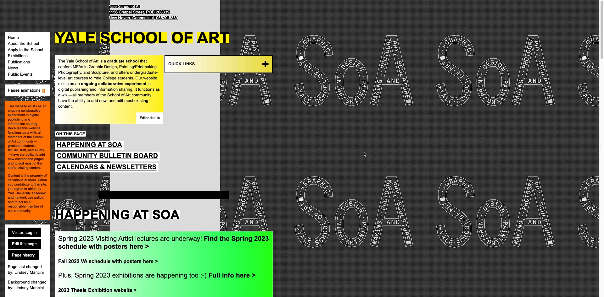
The landing page of this school website is filled with text that are trapped in colorful boxes. Some are highlighted in white or black but it almost makes it seems like there is a bunch of sticky notes that have been put up on the page. On top of that any prospective student wouldn't know where to start looking and get further confused with the busy site page. So it was important to incorporate a simplistic background with more basic UI design to make it more familiar with it's common users (i.e. students). To do that we would need a navigation bar at the top, a footer with the school's contact info, and content that was more organized and aligned at the middle.
How might we...
-
...organize information on the website so that students can make an informed decision regarding their graduate program?
-
include information regarding course requirements, housing accommodations, prospective career paths and resources provided by the university.
-
mention about school's exhibitions and networking events that take place.
-
-
...make students feel confident and secure during their application process?
-
have a list of documents they need to provide by a certain date.
-
include a timeline of when they would hear back from the university.
-
-
...design the user interface so that it is more accessible and easy to follow?
-
have heading hierarchies in place.
-
use contrasting colors when relaying information on the site.
-
User Persona

HOME PAGE
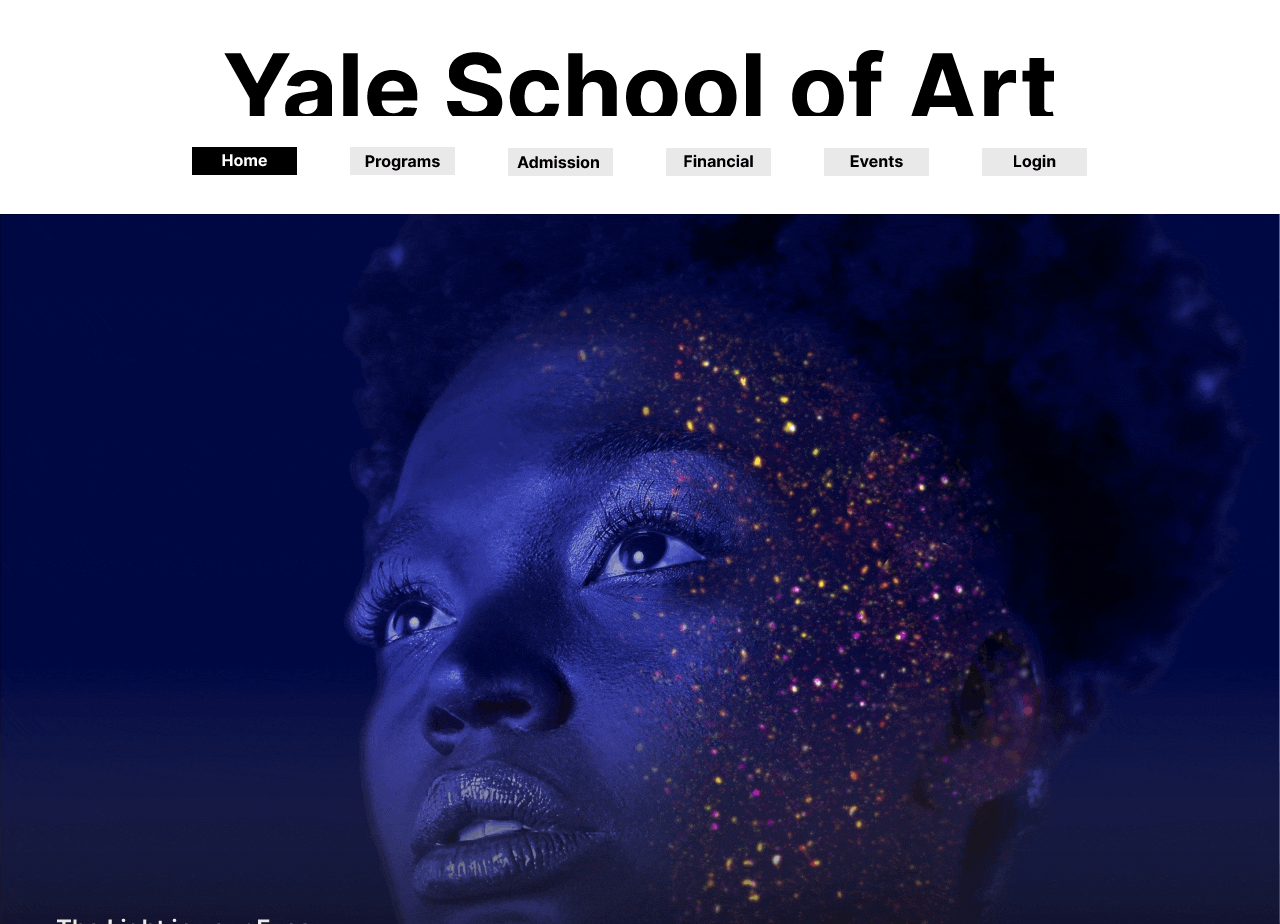
The landing page of the site has been changed to include three options and preview of artworks done by the students. This way, it will be easier for students to know which one they want to get more information on as everything has been categorized accordingly. Now, there is a navigation bar which is available in all pages so users can easily navigate from one page to another. At the same time, the footer has all the information regarding the school, from the address to social links that will connect the student with the school.
PROGRAMS PAGE
After analyzing the website, it can be seen that there are 4 graduate programs that are offered to undergraduates, each with their own requirement that needs to be fulfilled. Within each program, a series of courses must be taken by students in order to achieve the degree. Along with that many resources are also provided to students which they can use to help them out with their projects.

List of programs the school provides
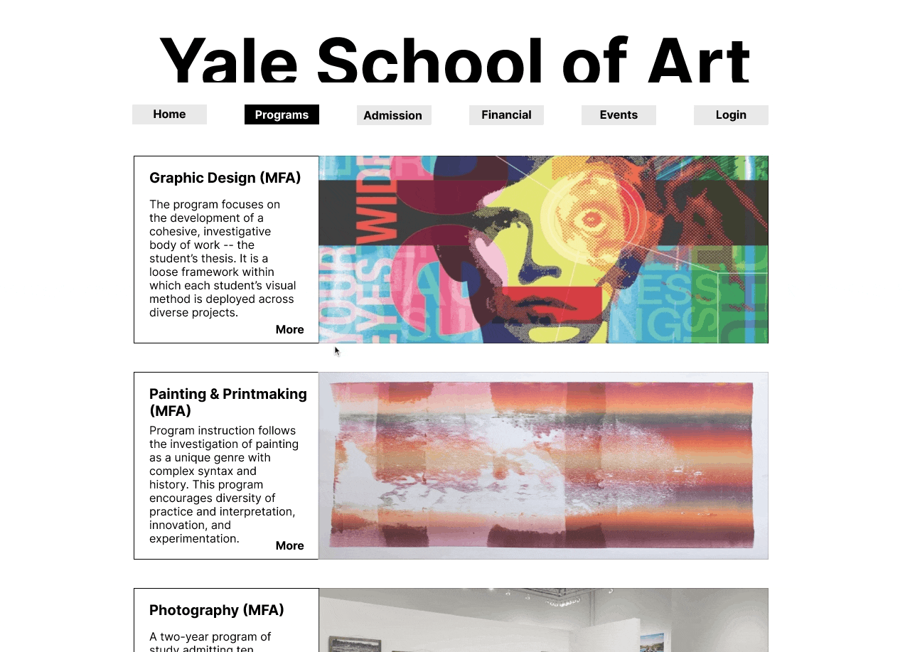
Overview of the Graphic Design program. Contains a portfolio of student's works along with course details and resources available
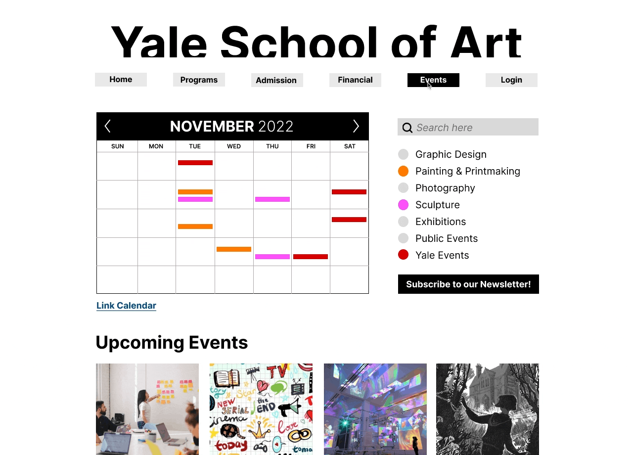
EVENTS PAGE
An extra feature that was added to this website would be the interactive calendar that color codes all the events that are happening around the campus. Whether it be program related or a student hosting their very own art exhibition, students are notified of the day-to-day activities happening at Yale School of Arts, so they can stay in touch with their community. At the same time, if there is a networking event, students can quickly register for that event.